As an ecommerce business, you want as many shoppers as possible to complete their checkout, and spend as much as possible in doing so, and social proof and urgency messaging are one of the most powerful ways to accomplish that.
This is because these methods tap into your customer’s psychology. The primary reason people don’t check out is that they have hesitations, for various reasons. They might be thinking about waiting till after their next paycheck, or doing more shopping later (which they may forget to do), shopping around first, or simply uncertain.
Whatever their reasons, social proof and urgency messaging encourage them to move forward with the purchase. Seeing how many others are purchasing, seeing specific individuals who are purchasing, seeing that others from their city are purchasing, showing when items are low in stock, etc. increases confidence in their choice, and induces FOMO to spur them on to follow through with their purchase.
Here are a few quick examples of effective social proof and urgency messaging strategies:
- Social proof only shown on items the visitor has viewed 3 times or more
- Showing “Best Seller” on only items that among the site top 20% sellers
- Showing red “Low in Stock” on items with less than 10 items in stock, and only on items that sold more than 5 times today
Social proof can be shown as embedded content that is a part of the page, or as popups which float over item images, and can include animations. For instance, you can show best sellers on category pages. But how does the magic of social proof happen?
Personyze is constantly tracking which products are viewed, added to cart, purchased, added to wishlist, etc. and all of this transactional data can be used as social proof. It’s just a matter of utilizing the data you already have, to maximize your sales.
Here are some more detailed examples of effective social proof and urgency messaging strategies for ecommerce.
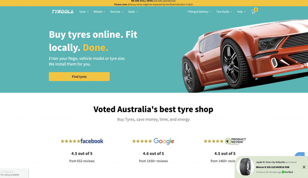
Home page popups
On the home page, showing the customer about recent purchases by someone in their city can instantly inspire confidence in your brand, from the moment they land. These can even be influenced by how they arrived, such as by showing items from the category of the ad campaign they were referred by.
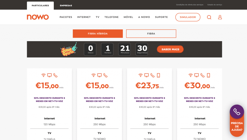
Showing a sale countdown can be a very effective way to move your customers along to checkout, and prevent them from leaving the site and abandoning their cart. These can be shown right on the item image, below the item title, or even as a banner/bar at the top or bottom of the page.
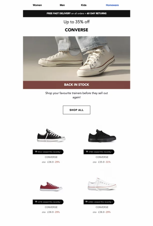
Show social proof on recommendations, anywhere on the site or in emails
Social proof and urgency messaging are often most effectively shown directly in recommendation widgets, and can appear as tags, tabs, badges, or any other HTML add-on design. Showing the customer how often items are purchased not only inspires confidence in their decision, but also actually guides them to products they’re more likely to want. These can also be added to your existing emails, transactional or otherwise, with our simple get-code email recommendations, and do not require any technical integration with your third-party email provider.

Product Pages
The product page is a key aspect of your social proof and urgency messaging strategy. Here, you can show the messaging on product images, near the product’s title and price, and the recommendations below, or all of the above. The key element is that you’re showing the appropriate message for the product they’re currently viewing, as well as the products being recommended.
We’re also showing how many viewed or bought on the product image, which can draw the customer’s attention to it more-so than showing it by the title/price.
In the recommendation below, we’re combining social proof and scarcity messaging together, showing them as tabs and tags on the products in the recommendation widget.

Cart page messaging
In many ways, the cart page can be the most critical point to utilize social proof and urgency messaging. This is because this is the point where the shopper may be questioning whether to proceed with their checkout. Whatever the source of their hesitation might be, this is your opportunity to lay it to rest.
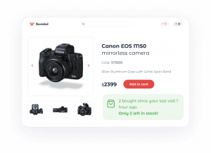
Here, we’re showing that the item that the visitor has in their cart has been sold 12 times in the last few days, and also that there are only 5 left in stock.
Social Proof for Category Pages
If you consider why someone is looking at a category page, it’s usually because they have a general idea of what they want, but are open to many possibilities. One great way to avoid choice anxiety and direct them toward products they’re likely to be interested in is to provide badges that show various types of social proof and other messaging.
Here are a few of the types of badges that might take your category pages to the next level:
“Popular! This item was purchased by 30 customers today” — You can set this social proof messaging to only show on the top X% selling items.
“On Sale! 20% OFF!” — You can set the system to show this on items that are currently on sale, just enter the date range for the sale.
“Best Seller!” — This can be added to items that have been purchased the most over longer time periods, or in all time.
“You purchased previously” — This can be very useful for items that customers might want to buy regularly, such as food, refillables, perishables, or supplies. This can be shown as an add-on, floating above the images, or in text below where the title and price are. For instance, for items that were purchased previously, anywhere they see the item on other pages, in recommendations or on category pages for instance, they can see messaging reminding them that this was an item they purchased in the past.
“Brand new from [BRAND]” — This social proof display can take into consideration the brands that the customer has purchased from in the past, and show new items from that brand. These can be shown as tags or tabs or other visual elements hovering over the images of the products, or below the images where the product title and price normally are.
All of these badges can be added to only a certain portion of products, based on criteria set by you. For instance, you can set those related to popularity only to those on the top X% selling items, or other criteria may involve whether or not the customer purchased them in the past.
Whatever your logic, Personyze can display badges like this with virtually any design, ranging from literal badges to ribbons, tabs, circles, squares, or anything else you can create with HTML.
Category and Search Pages
For category pages, you typically have mosaic-styled displays showing many products that are part of each category. Here, you can take the opportunity to spice up the product displays, by adding tags, other add-ons that others are purchasing, or that they are low in stock.
For instance, you can show on the top 25% selling items a tag that says “Best Seller,” and on those items that have less than 20 in stock, show “Low in Stock.”
Social Proof in Get Code Emails
The same principle applies to the product displays you send in email recommendations. These are pulled in image form by our open-time email recommendation codes, and adding social proof is simply a matter of adding the messaging to the images before they are sent, which you can do in the design portion of the recommendation wizard.
For instance, you could even send an entire email campaign centered around scarcity messaging, where you show the shopper all the items they viewed more than once that are either low in stock or on sale, with Best Seller medals on those items that are in your top 20% sellers.
