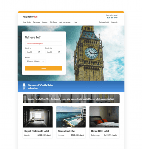
Travel website personalization is well worth the effort. Planning for travel can be stressful for customers, so when they have a smooth, personalized experience with a travel brand, they remember it, and they return to that same brand for their next vacation.
Here are a few easy wins for travel websites looking to incorporate personalization into their existing user experience.
Homepage Travel Personalization
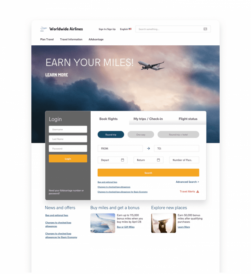
The header of a travel website’s homepage is the first thing most visitors will see, whether new or returning. This is prime real estate for personalized messaging, determined by previous visits and searches for return visitors, especially.
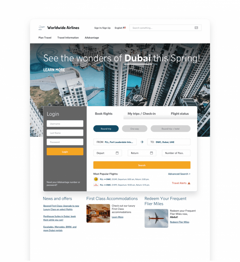
For instance, on a flight booking website, customers who have been previously identified as interested in luxury travel and certain luxury destinations can be shown a relevant header.
On the other hand, if someone recently booked a flight to a particular destination, you can show them a banner for rental cars in their most likely price range, based on this previous purchase.
Likewise, lower down on the homepage, content recommendations can be shown that are also related to their recent booking, such as particular rental cars, accommodations, entertainment during the time they’ll be there, or tours and adventures that are available for that destination.
Messaging can also be incorporated based on flights they previously viewed multiple times, urging them to book a flight whose date is within 2-3 weeks. Another angle would be to show scarcity messaging, such as “Your flight only has 5 seats left!”
You can also show accommodations based on flights, essentially cross-selling, in the manner of “Those who booked this flight also book these hotels.” Not only will this be convenient, but will also provide an element of social proof, reassuring the traveler that they are doing what others visiting the same destination are doing.
Travel Recommendations
Using algorithmic recommendations on travel sites has been catching on for some time now. Just as it’s expected on ecommerce sites, it’s increasingly expected and always advantageous in this context, as well.
Recommendations on individual listing pages can be based on various factors, such as the customer’s destination, price preferences, season of travel, and more. You can show the most popular destinations among others from the visitor’s known location, the best deals on accommodations at the same destination as the one they’re currently viewing, or the most booked trips of the Summer, for instance.
Various social proof and urgency messages can also be added to recommendations and product displays around the site, based on availability of flights or accommodations, how many are purchasing, and many other data points that already exist on the website.
For instance, on the page for a particular city or destination, you could show social proof messaging on the most booked accommodations, and scarcity messaging on those that are nearly booked up for the travel dates they’ve searched for recently.

Popups
A variety of uses for personalized popups exists on travel websites.
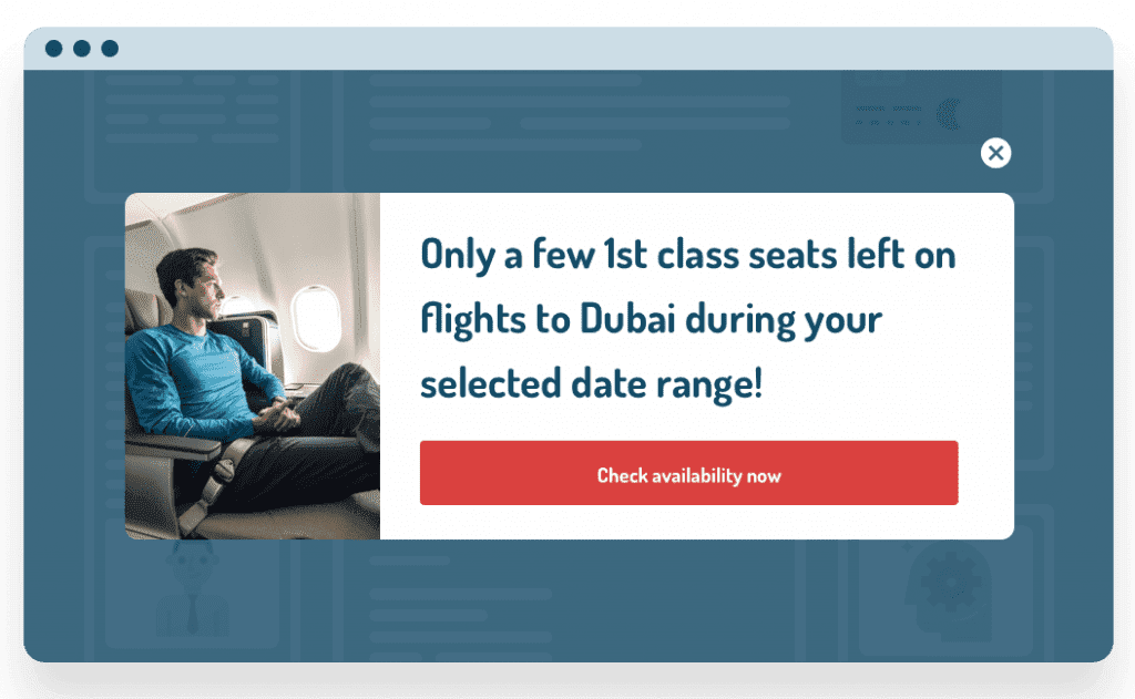
Exit popups are especially useful if someone has been looking at flights, then tries to leave. In such situations, you might want to show an exit popup letting them know there are only a few seats left on the flight they were looking at, or reminding them that prices will only go up.
Popups offering temporary booking fee waivers can also motivate customers to complete their checkout. For instance, if someone has added flights or accommodations to their cart, but not finished and tries to leave, you can show a popup offering a fee waiver if they book in the next 15 minutes.
Beyond exit intent popups, you may want to show sale countdowns for those who clicked through an email promotion for a sale as a popup or top/bottom bar, show social proof popups letting them know where people from their city are booking trips to, or if they’re in the process of booking a trip, show the most frequently booked entertainment or adventure for that destination in a popup during their checkout process.
Personalized email marketing for travel websites can involve dynamic recommendations based on their most recent booking experience on the website. Any recommendations you would put on the website can also be added to email.
For instance, if someone recently viewed several hotels in the same destination, you can send an email specifically showing them which hotels that they previously viewed are nearly booked up, are most popular, or both. In the event of flight cancellations, you could also add recommendations for alternative destinations in the email notification about the cancellation.
On the other hand, if they haven’t booked yet, you can let them know when flights they were looking at are nearly booked up. To the customer, this feels more like a service than a marketing email, and they may be genuinely grateful for the notification to finish booking. Of course, in these kinds of emails, you can also always include additional recommendations to cross-sell other cars, accommodations, adventures and tours, etc.

Conclusion
Personalization for travel sites doesn’t have to be difficult, and when done properly, it can do more than increase your revenue, but can actually transform what is often a stressful planning process into an easy and fun experience, which always means they’ll be back for more when the next vacation rolls around.

